A university that can do it all (architecturally)
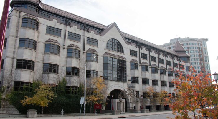
The duality of architecture featured on the University of Ottawa campus is astounding. Aesthetically, I find myself wondering how Simard and Hamelin can coexist with Morrisett — how I can walk past the STEM Building, only to be met with Colonel By? If you’re looking for a university that can do it all, you’ve found it right here in Ottawa.
As someone who first became acquainted with campus during the height of the pandemic when just about everything was closed, I had plenty of time to get to know the exteriors of these buildings. Naturally, I couldn’t help but notice the contrast between the artfully constructed buildings that have aesthetically stood the test of time, and the ones that look like their blueprints were made on Minecraft by elementary school students.
In order to fully appreciate the variety of buildings that comprise the U of O campus, it is my civic duty to analyze the best and worst of what campus has to offer.
Faculty of Social Sciences (FSS) Building
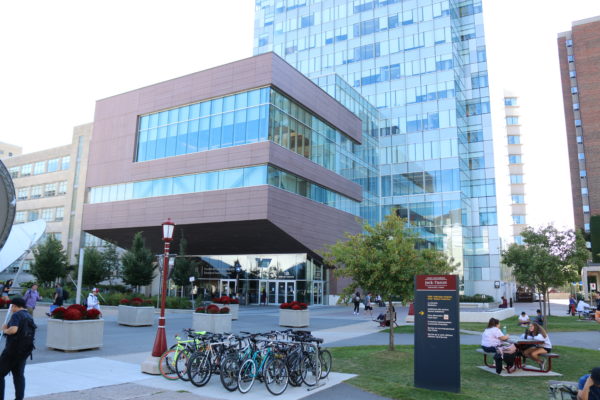
The pride and joy of University of Ottawa campus brochures, FSS lives up to the hype. Inside and out, this building is among the U of O’s claims to fame. What’s not to love? This building features the famous living wall of plants, many windows that make the studying experience slightly more bearable, and a variety of seating and study rooms throughout the building. It also includes a cute café on the first level that has recently reopened, Première Moisson, where you can use your student card to grab a pick-me-up between classes. What establishes it as my favourite building on campus is its sustainability features, including the living wall’s role as the building’s air filtration system. At the risk of being called biased, as a social science student myself who often studies in FSS, I would have to say this building is my favourite. Overall, it gets a 10/10 from me.
Tabaret Hall

No wonder Tabaret Hall is featured on the U of O logo. It deserves all the clout, with a gorgeous curb appeal and a beautiful interior to match. The pillars and grand foyer are timeless. Tabaret Lawn is especially charming this time of year, decorated with autumnal trees and grass covered in colour leaves. Tabaret gets a special bonus in my books for the dogs that frequent the lawn and, if you’re lucky, run up to you while you’re studying on a nearby bench — true story. Though it is beautiful, I find it a bit weird that a six-pillared building is represented to have five pillars on University of Ottawa merchandise. As such, I would rate Tabaret Hall a 9/10.
Hamelin Hall

I am a big fan of this one. Hamelin is among the underappreciated buildings on campus, if you ask me. The building’s key attractions include an arched entryway, composed of bright windows, a well-lit foyer paired with a charming staircase unlike others seen on campus, and a beautiful walkway outfitted with seating that connects the building to its neighbour, Simard Hall. The old-fashioned architecture of the hall and the vines that encompass it are part of what I find special about Hamelin Hall, not to mention the storied Batcave (of faculty of arts frosh fame) and a lovely grand staircase. If it boasted of more study spots, I would consider ranking the building higher. Hamelin, in my books, is an 8/10.
100 Laurier
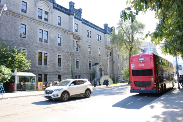
Old-fashioned architecture as my vice, I absolutely love the design of 100 Laurier Avenue. As the oldest building on campus, built in 1893-1894, it is no surprise that I am so fond of it. They don’t make them like they used to, it seems. This is the type of look I wish other buildings on campus would emulate, especially Morrisett. A library should look like a castle! I don’t make the rules — except in this ranking system, in which I do. As a consequence of Zoom-University, I haven’t been able to frequent the interior of the building, so it sits at a 7/10 with room for improvement.
Learning Crossroads
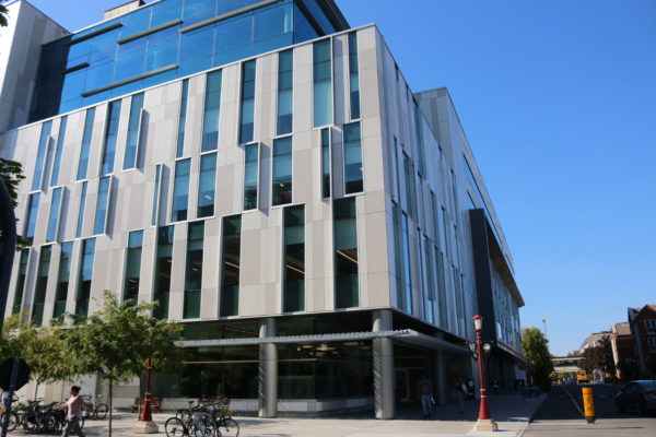
Learning Crossroads is among the buildings on campus that exude that high-tech (and prone to aging) look. Upon entry, you’re met with plenty of seating, vending machines, and an art fixture that I have yet to understand. In the facility, there are a variety of study spaces, including study rooms, reading rooms, two libraries, and plenty of other features (including a state-of-the-art media and gaming room). Overall, if you’re looking for a good spot to study, this could very well be it. With windows all along its perimeter, it is well lit, as well. I would have ranked this one higher if I didn’t have a preference for that ornate, olden-timey architecture. However, I do respect that it’s attractive in its own modern way. As such, Learning Crossroads is a 7/10.
STEM Complex

I’m a huge fan of windows, which is why the STEM complex gets a high ranking. It also gets a bonus point for the artistic depiction of two eyes it features on the exterior of the buildings. Some may call it “creepy” — I’ll go with “abstract.” Its high-tech futuristic exterior is fitting for a STEM complex. For it’s true-to-theme design, I will let go of my old-timey architecture pretentiousness, and rank this building a 7/10.
SITE Building
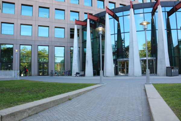
The SITE Building is a rather aesthetically pleasing edifice on campus. It comes outfitted with many windows, high-tech and energy-efficient features, but more importantly, a Tim Hortons — though it has yet to reopen since the COVID-19 closures. Tables are scattered throughout this building for your studying pleasure. This building would have been ranked higher, had it been more unique. However, for reasons unbeknownst to me, there is a near-exact replica of SITE, down to its red and yellow finishings, on the Lakehead University Thunder Bay campus. Naturally, it loses points for its lack of uniqueness. I rank SITE a 7/10, though I would be willing to reevaluate, should the Tim Hortons reopen.
Morisset Library
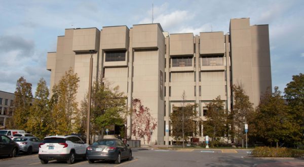
I do feel bad ranking this building so low on the list, as there are definitely some attractive spots in Morisset Library. The fifth floor boasts a fireplace and some great window seating for students like myself who get borderline-claustrophobic in poorly lit spaces. However, from the outside, it is just short of being a cinder block. It is one of the handful of buildings that looks freshly made on Minecraft. It does its job, sure. However, when Queen’s University boasts a library that is nicknamed the Harry Potter Library, I can’t help but be jealous. For those reasons, I can’t help but rank Morisset Library a 5/10.
Montpetit Hall
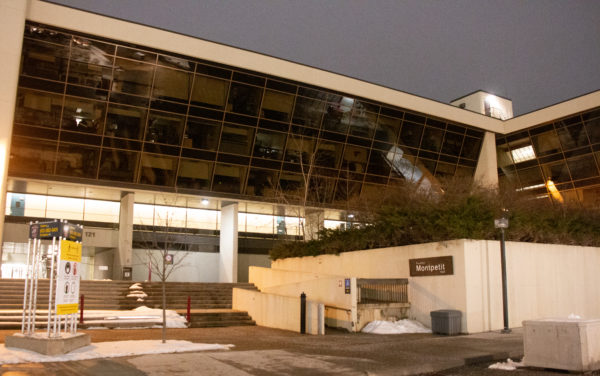
Montpetit Hall is decent. Does it do its job? Sure. However, as far as aesthetic appeal goes, I’m not its biggest fan. From the outside, it is another one of those new, boring buildings. It lacks the ornate finishing that many campus buildings brag about. The lecture halls are often freezing, and windows are far and few between. It is also extraordinarily easy to get lost. My main complaint is the size of the gym, which is so small that I can’t imagine it functioning at its full capacity rather than the 20-person maximum that it is afforded during the pandemic. For its overall dreariness, I regard Montpetit as a 4/10.
Colonel By Hall
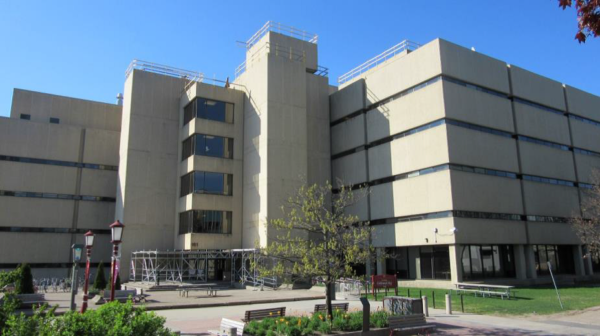
Colonel By Hall is among my least favorite of the University of Ottawa buildings, perhaps unfoundedly. However, it is hard to appreciate the exterior appeal of the building when it is juxtaposed so strongly by its neighbour, the STEM building. The lecture halls are nice enough, and the washrooms are decent — I appreciate the black and white speckled stall doors. Artistic choice! However, the limited windows and unfortunate curb appeal causes me to rank this building at a 3/10 – my apologies to the Faculty of Engineering.
All in all, it is apparent that the U of O campus is diverse in terms of the edifices that comprise it. Though some are prettier to me than others, I’m sure some may prefer the look of some buildings that I disliked. One man’s trash is another man’s treasure, right?

