Did they put any thought into the course enrolment application on uoZone?
We don’t even need an article, we’ll just throw in the screenshots and let those do the work.
An unfortunate reality of attending the University of Ottawa is how difficult it is to navigate the U of O’s website. It’s difficult to find what you’re looking for or even any contact information to get someone to help you find what you’re looking for. Not to mention, all the webpages are also incredibly ugly.
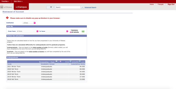
While there is a lot of information to include on a university website, the U of O seems to have put in very little effort into the design and user-friendliness of their main webpage and all parts of uoZone including course enrolment, academic requirements, and statement of account.

All of these very important things should be easy to find and easy to navigate.
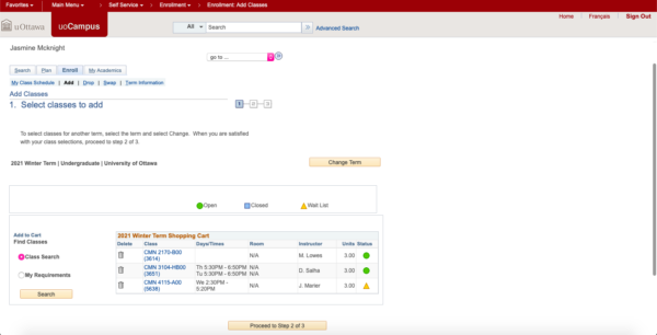
Instead, they are outstandly ugly with mismatched fonts, ugly colours, and simply lack any appealing visual factors. In addition to the horrendous design, the applications linked on uoZone often don’t load on the first try, forcing you to close the tab and try again.
The uoZone course enrolment tool is one of the ugliest and most difficult to use tools. If you want to enrol in a new class, the only way to know if there is a conflict is to either put the entire course sequence manually into a separate calendar, writing down each course with the corresponding date and time, or just to add the course and hope there are no conflicts.

Also, the only way to choose electives, is to look at an alphabetical list of courses, where half of them you can’t even take anyways, and some of them have no courses to choose from.
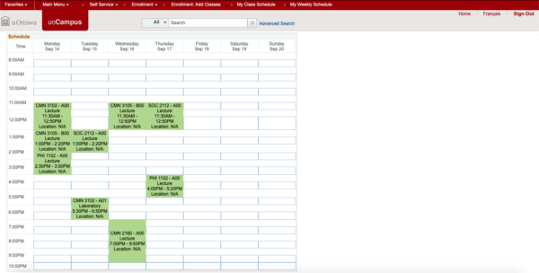
Afterwards, you get this terribly ugly schedule.

The University should take a tip or two from the student developers of an easier class enrolment tool, uSchedule. It is not only nicer, and easier to use, but also works much better with little to no glitches. It’s safe to assume we all have had the issue of choosing a class then having an error come up where you have to go to the last working page on uoZone.
There are so many improvements that could be made to the U of O’s webpages, so please start with making them more appealing and more importantly, user friendly.


